A selection of designs I made over the years

Birth card

During my internship at Kek Mama I made all kinds of things including this birth card. They gave me a name and a previous card as an example, but other than that I was free to make whatever I wanted. This is the end result. I’m very proud of it because typography wasn’t my best skill at the time.

Folding folder/poster

This design is a little more complicated than usual, because it’s a folding folder and a poster in one. It was really challenging to design something like this, but I was up for the challenge and I learned a lot from it. I think it turned out pretty great considering this is not really my style of design.

Magazine

This is a magazine for a photography museum. The goal was to make a magazine suited for young and old so the museum can attract a wider audience. They wanted a design that’s modern and artsy but also speaks to everyone, no matter their interests. This is the design I came up with. I kept it clean and simple but also added the lines for a modern/artsy effect.

Tote bag

The Jaarbeurs Utrecht needed a design for their anniversary gift to work relations. The subject would be special meeting, about how the Jaarbeurs brings people together. This was my entry for their design contest. Sadly I didn’t win but it was still a fun and creative experience.

Typographic poster

I made this design during my internship at Kek Mama. It’s a design for a typographic/quote kind of page in their magazine. They gave me the quote, some fonts and some examples from previous pages. After many tries this is what I came up with. The idea is it looks so nice and creative you could put it up on your wall like a poster.

Visual identity

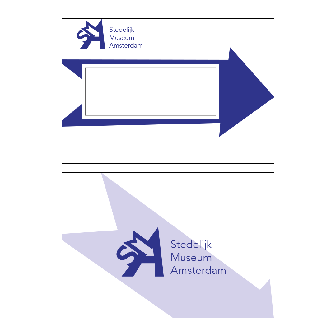
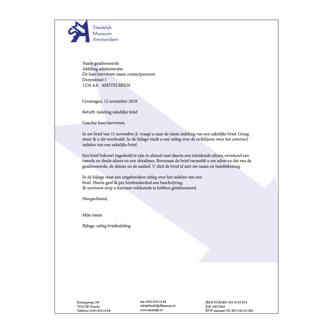
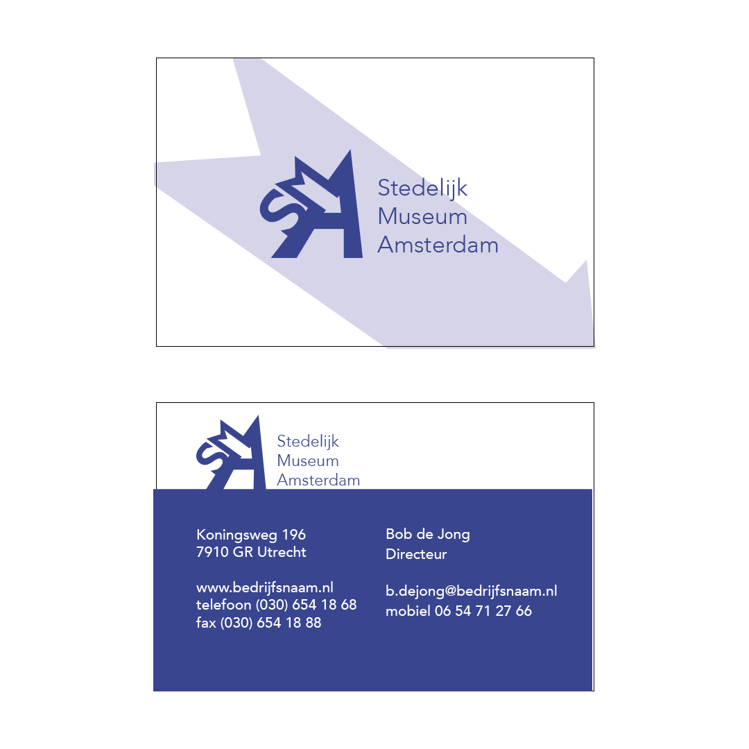
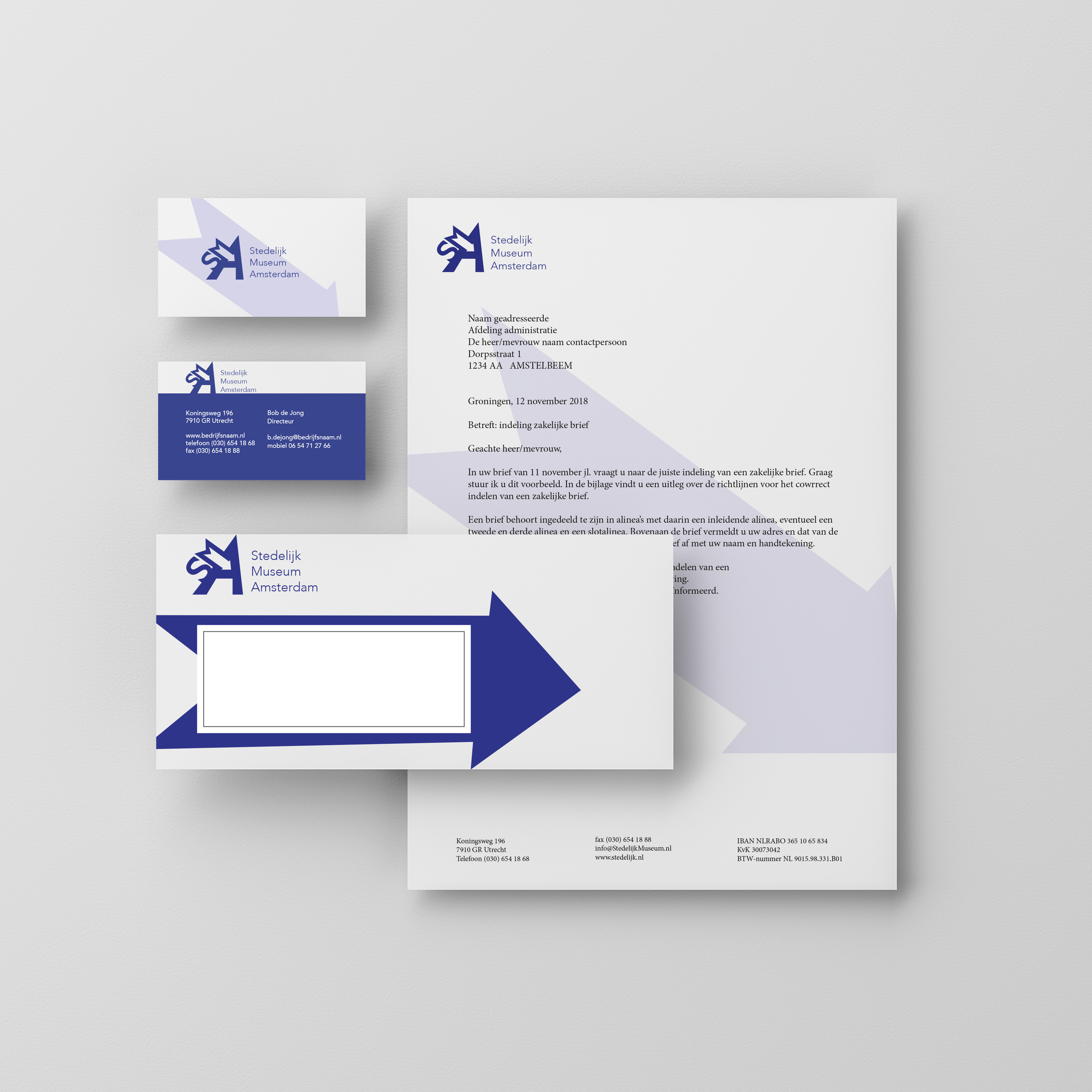
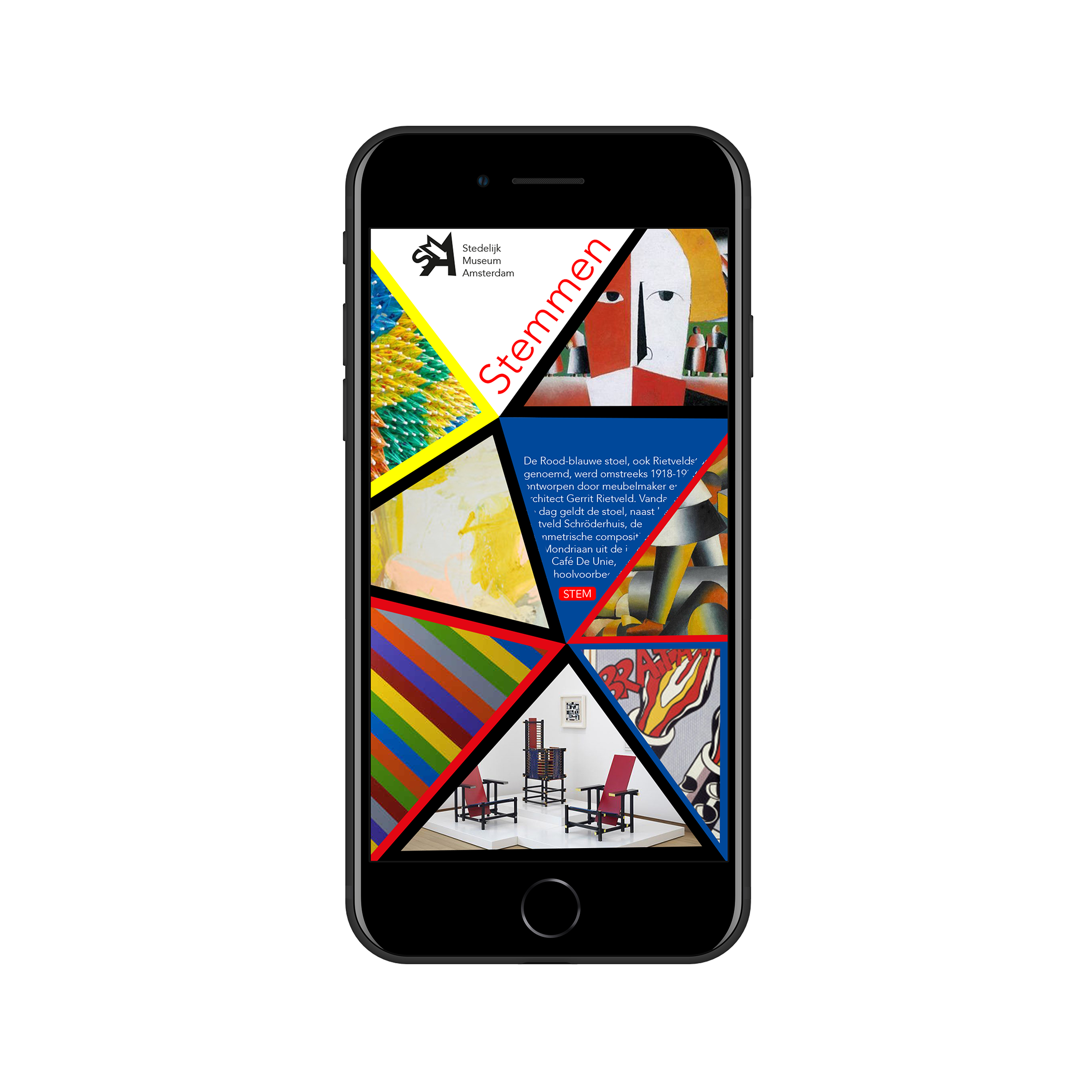
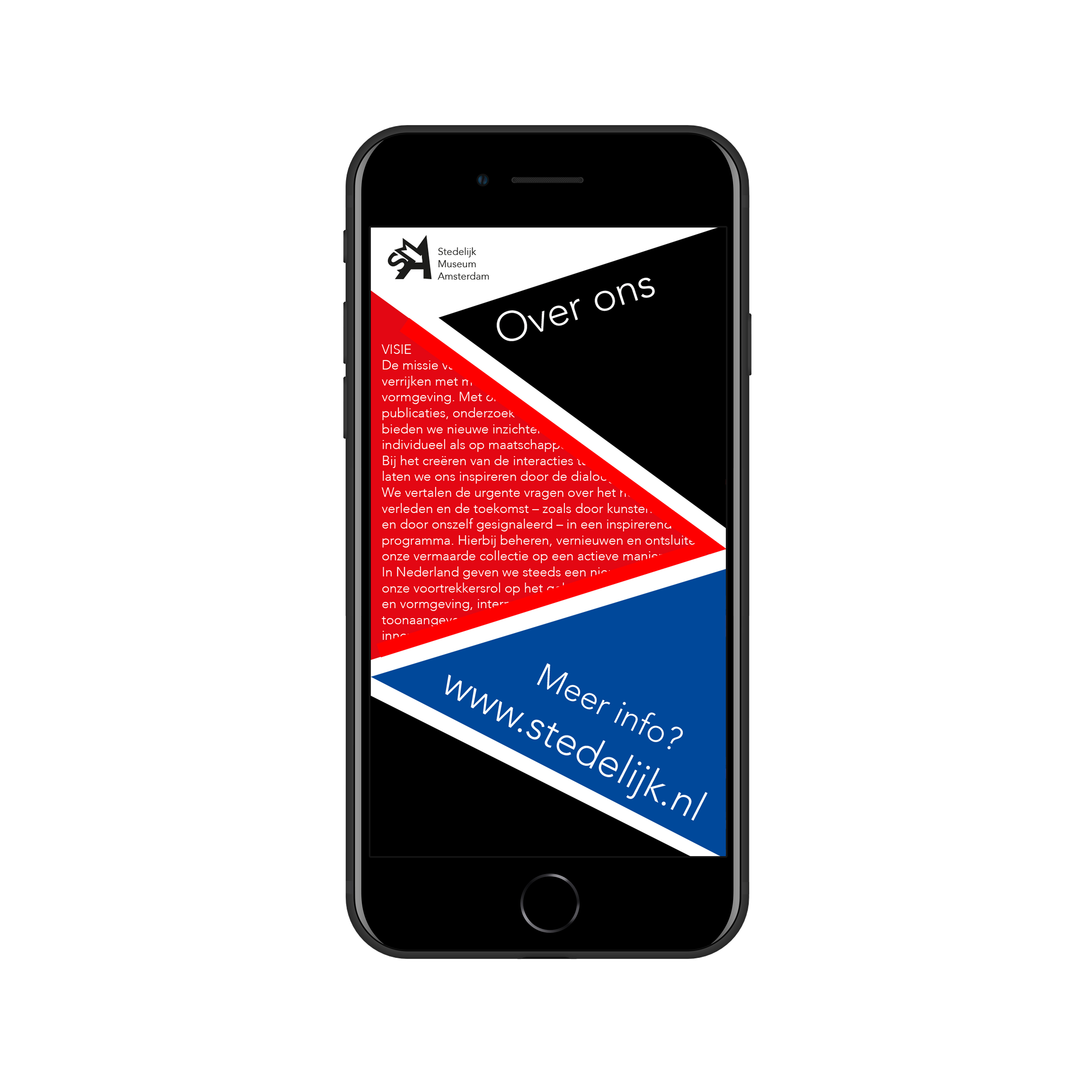
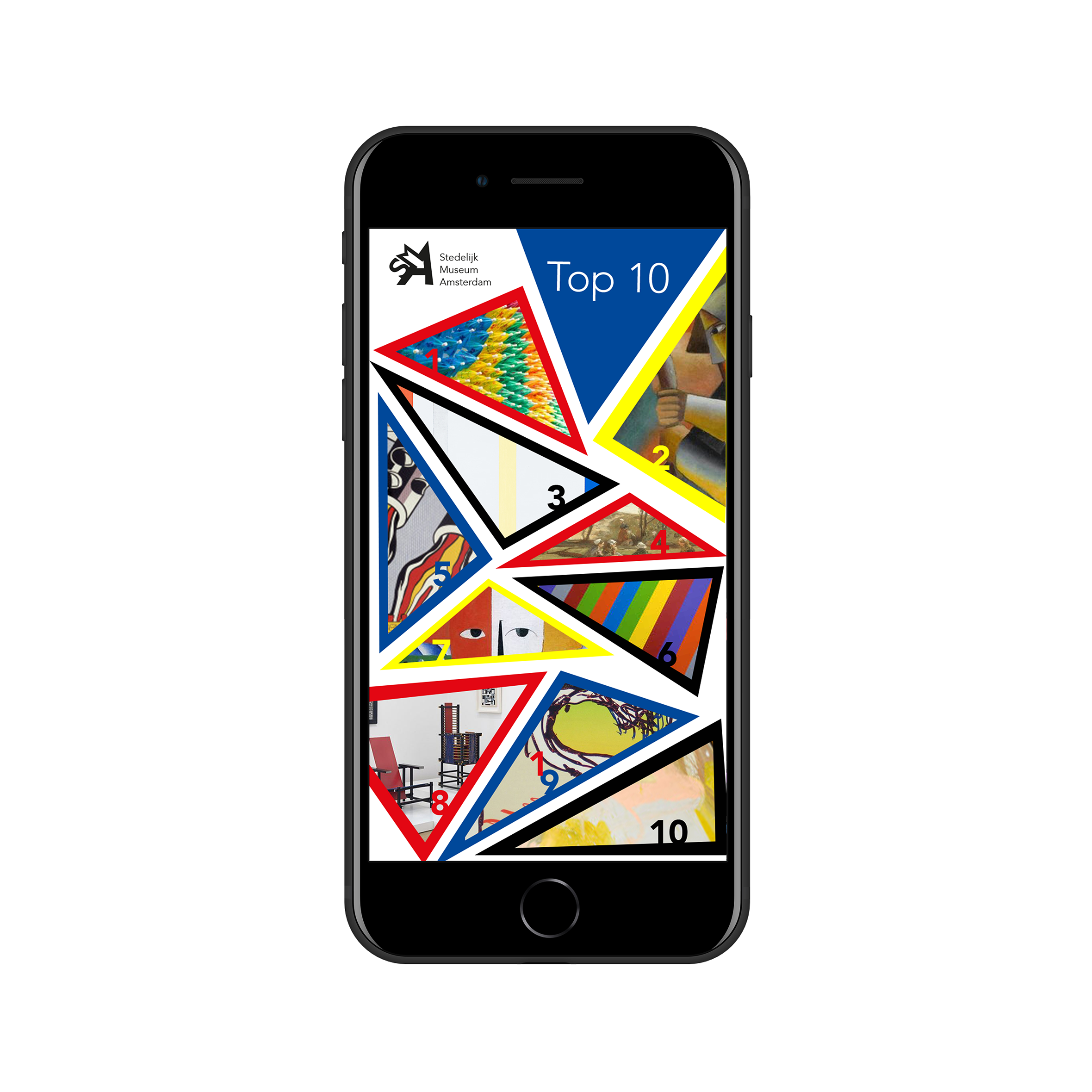
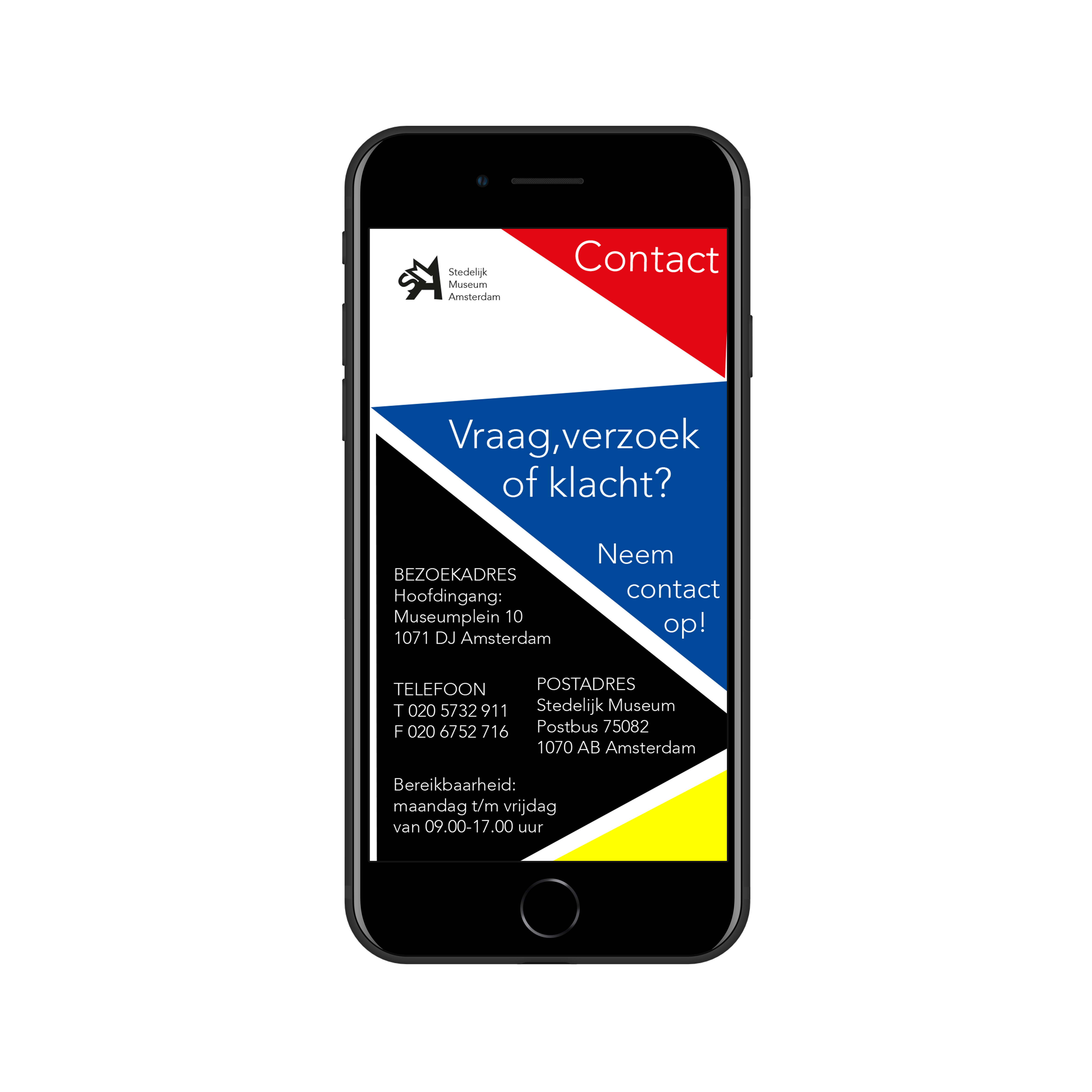
The Stedelijk Museum Amsterdam needed a new visual identity. They wanted it to be artsy, modern and innovative. At first I came up with a really boring and simple typographic logo. Then I decided to sketch, and sketch, and sketch some more, until I came up with this logo. I was playing around with the letters and started to see the arrow. I thought it really fit their wishes so I decided to go with it and work up the visual identity from there.

App

Together with the visual identity also came an app for the Stedelijk Museum Amsterdam. They wanted a completely different design from most apps and they wanted the artsy part to really show. Thats why I went with the triangle layout. It really shows the artsy part, but is also really functional because the possibilities are endless.

Packaging

This design is for a green/biologic version of RedBull. The assignment was to make it look as extreme as RedBull is while also showing off the green aspect of the drink. Thats why I went with the explanation point, it shows that it’s extreme and has power. Within the explanation point it says “extreme green” and to make the green aspect stand out even more I made the can a bright green.

Poster

I made this poster during my internship at Kek Mama. It’s a celebratory gift for their colleagues of Libelle. I was asked to make a festive poster that fit both Kek Mama’s and Ouders van Nu’s style so they could give this poster together. I went with the typography from Kek Mama and the image and color of Ouders van Nu. The people from Libelle liked it so much they put it up at their workspace!

Photography/art

In my free time I also like to take lots of photo’s and make art. Enjoy!

Iris van der Veen
Iris@huizevanderveen.nl